Background
Build Deli is a construction materials supplier with the goal of simplifying how contractors, builders, and homeowners source building materials. The company emerged from recognizing a gap in the construction supply market: while materials were widely available, the procurement process was often fragmented, time-consuming, and lacked transparency. The brand focuses on transparency, efficiency, and reliability, aiming to create a seamless procurement experience supported by quality materials, price matching, and dependable delivery. By combining a curated network of suppliers with customer-centric service, Build Deli aims to become a trusted partner for construction professionals and property owners throughout the building process.

Brand Identity:
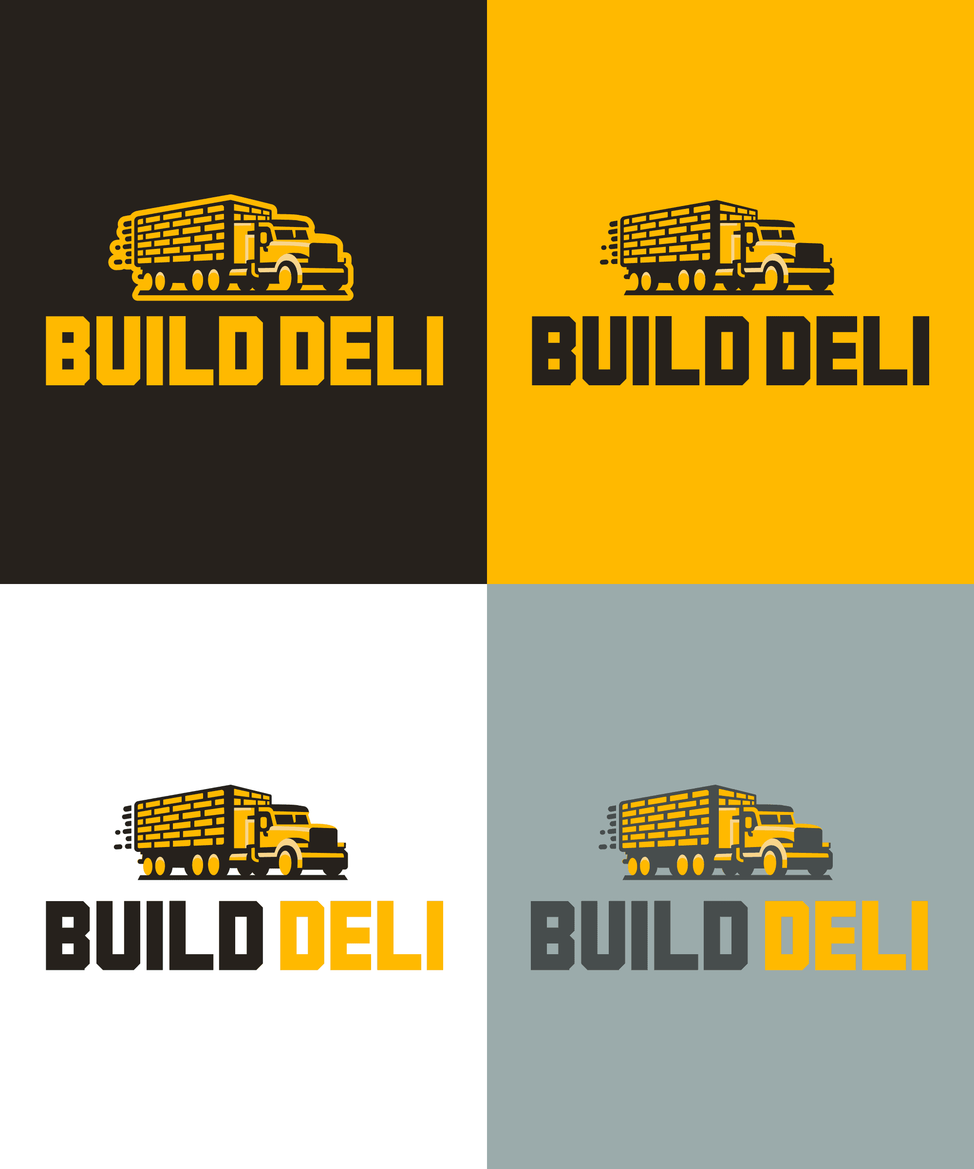
The logo combines two key elements of the Build Deli business model: construction materials and delivery logistics. The truck carrying stacked bricks represents the company’s role in transporting essential building supplies directly to construction sites. The icon uses bold geometric shapes to maintain clarity and scalability across digital and physical applications. The typography uses a heavy industrial-style typeface with strong vertical strokes and angular cuts, inspired by construction signage and structural forms. This reinforces the brand’s reliability and strength while maintaining legibility across applications, while the yellow and charcoal palette references construction safety colours and industrial environments. Together, these elements create a mark that visually communicates material supply, reliability, and efficient delivery.

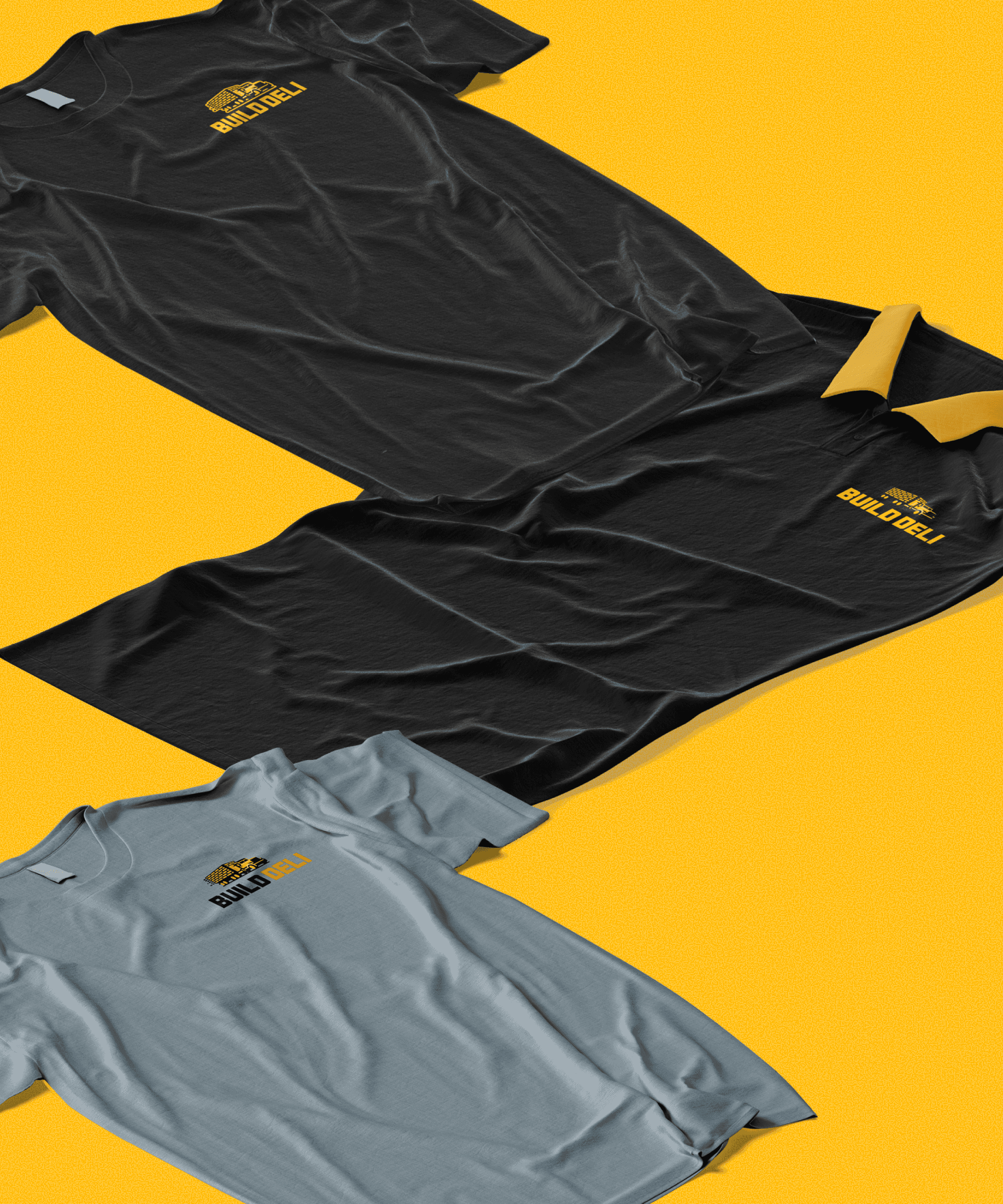
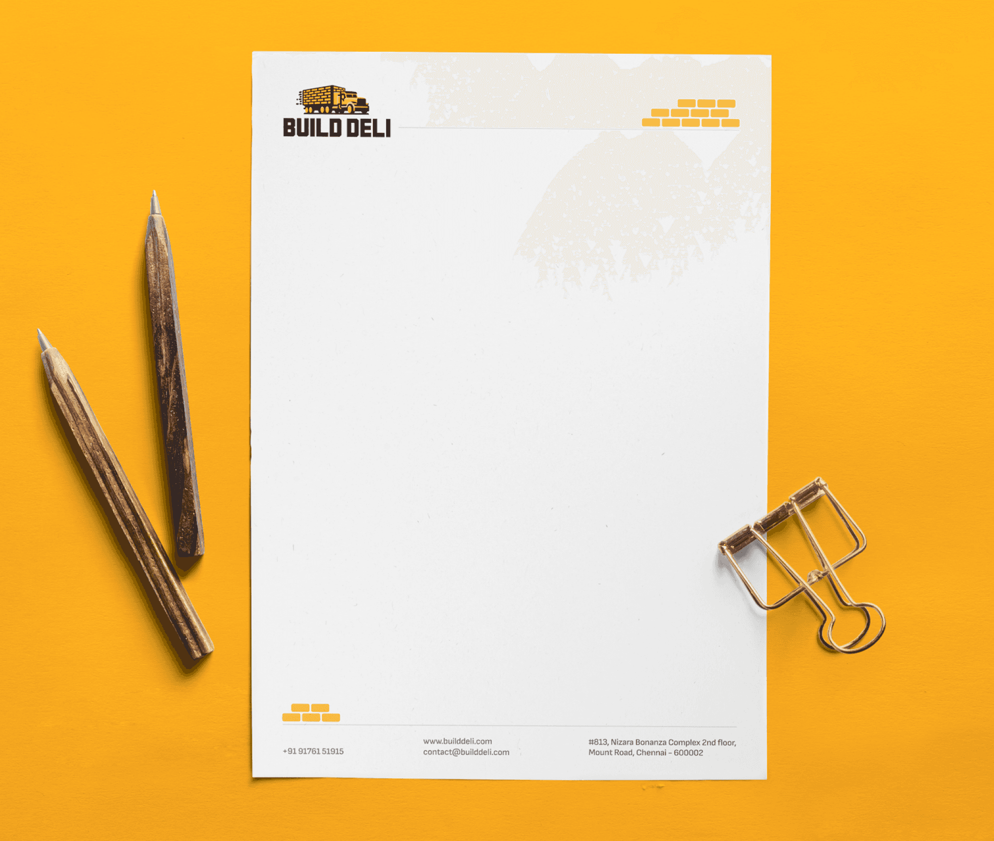
The Build Deli identity extends across key business collaterals including business cards, envelopes, letterheads, and staff apparel to ensure a consistent brand presence across professional and operational touchpoints. The designs use the brand’s yellow and charcoal palette, creating strong visibility while referencing colours commonly associated with construction environments. Minimal layouts and bold logo placement keep the materials clean, functional, and easily recognisable. From stationery used in client communication to branded t-shirts worn by staff on-site, the collateral system reinforces Build Deli’s image as a reliable and professional construction materials supplier.


This project was an opportunity to develop a brand identity that visually communicates the core operations of the business, which are construction materials and delivery logistics. A key focus was creating an identity that felt both industry-specific and easily recognisable, using simple geometric forms and bold typography to ensure clarity across different applications. Translating the identity across multiple touchpoints such as stationery and apparel also helped reinforce how a brand can maintain consistency in both digital and physical environments. Through this process, I gained a deeper understanding of how visual symbolism and practical application work together in brand design. Designing the identity system required balancing strong visual impact with functional considerations such as scalability, legibility, and versatility across print and merchandise. The project highlighted the importance of building a cohesive visual language that supports the brand’s positioning while remaining adaptable across real-world use cases.