The Kati Roll Shop
The Kati Roll Shop
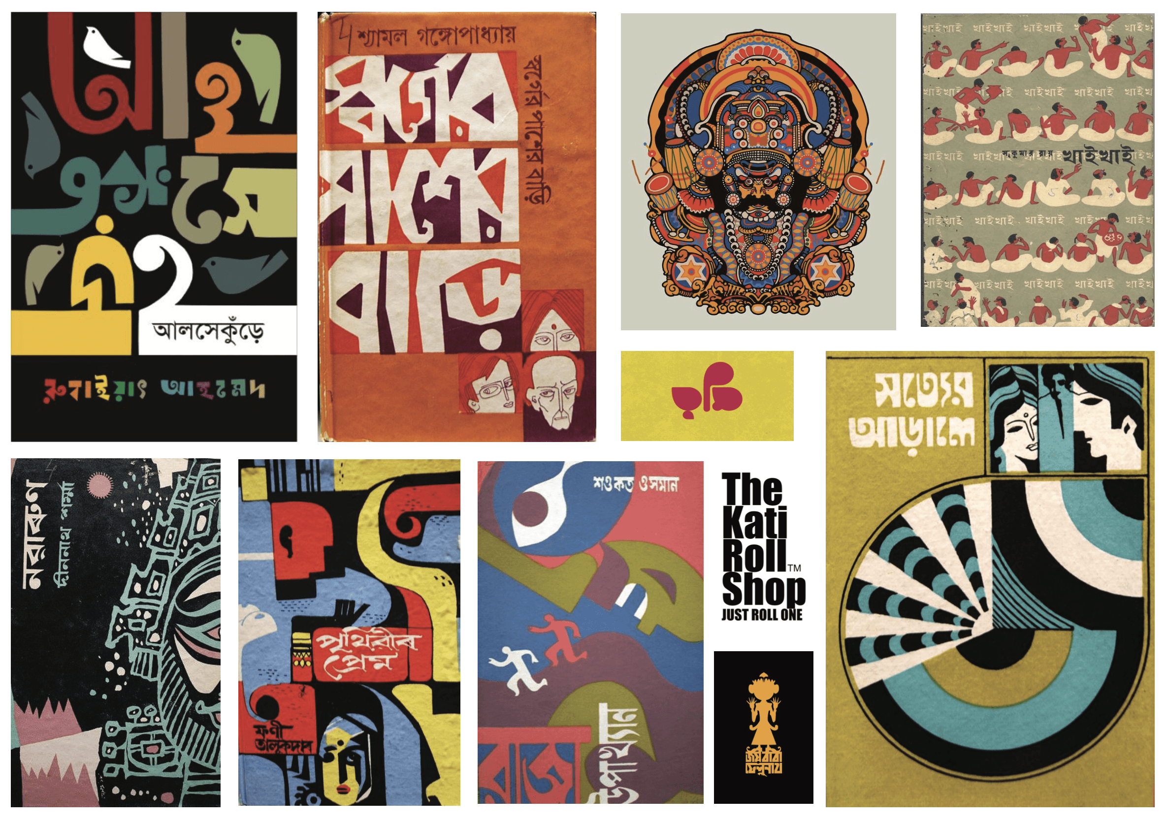
For this packaging design project, I reimagined the visual identity of The Kati Roll Shop through a bold, culture-led packaging system inspired by Kolkata’s street food energy. The aim was to create packaging that felt instantly recognisable, playful and rooted in place — combining expressive illustration, Bengali visual references, vibrant colour and the everyday chaos of the city. The design explores how food packaging can become more than a container; it can act as a storytelling surface that captures the flavour, movement and personality of the brand. From the iconic yellow taxi to hand-painted typographic details and regional graphic motifs, every element was used to bring a sense of Kolkata’s streets directly into the customer experience. For the moodboard, I wanted to build a visual language that felt unmistakably Kolkata — loud, nostalgic, expressive and full of movement. I drew inspiration from Bengali graphic posters, hand-painted street typography, folk motifs, old book covers, tram/taxi culture and the bold visual chaos of Indian street food spaces. The references helped shape a direction that was playful but still rooted in place: saturated reds and yellows, chunky black type, illustrated patterns, cultural symbols and layered compositions. This moodboard became the foundation for the packaging design, guiding the use of high-contrast colour, expressive illustration and a street-style energy that makes the Kati Roll Shop feel vibrant, memorable and proudly regional.
For this packaging design project, I reimagined the visual identity of The Kati Roll Shop through a bold, culture-led packaging system inspired by Kolkata’s street food energy. The aim was to create packaging that felt instantly recognisable, playful and rooted in place — combining expressive illustration, Bengali visual references, vibrant colour and the everyday chaos of the city. The design explores how food packaging can become more than a container; it can act as a storytelling surface that captures the flavour, movement and personality of the brand. From the iconic yellow taxi to hand-painted typographic details and regional graphic motifs, every element was used to bring a sense of Kolkata’s streets directly into the customer experience. For the moodboard, I wanted to build a visual language that felt unmistakably Kolkata — loud, nostalgic, expressive and full of movement. I drew inspiration from Bengali graphic posters, hand-painted street typography, folk motifs, old book covers, tram/taxi culture and the bold visual chaos of Indian street food spaces. The references helped shape a direction that was playful but still rooted in place: saturated reds and yellows, chunky black type, illustrated patterns, cultural symbols and layered compositions. This moodboard became the foundation for the packaging design, guiding the use of high-contrast colour, expressive illustration and a street-style energy that makes the Kati Roll Shop feel vibrant, memorable and proudly regional.
Client
Packaging
Packaging
Year
2025
2025
Project type
Food & Beverages
Food & Beverages
Credits
Chennai
Chennai