Background
Wundrchat is a mobile chat platform that provides a seamless, enriching and delightful chat experience to its users. Relevant in both informal and business contexts, Wundrchat’s features are carefully designed to be both engaging and efficient. Apart from being a chat product Wundrchat also has features for online payment and integrations with other apps that facilitate a “one-stop-app” experience.

Logo Construction:
The Wundrchat logo was designed to visually represent connection, communication, and interaction within a single unified symbol. The mark is constructed using four rounded forms arranged symmetrically around a central star, symbolising multiple users converging within one platform. The circular geometry reinforces the idea of conversations, message bubbles, and continuous interaction. A gradient blue colour palette was chosen to communicate trust, technology, and digital fluidity while maintaining a modern and approachable feel. The rounded shapes soften the technical nature of the product, making the brand appear friendly and accessible. The resulting mark is simple, scalable, and recognisable across app icons, interface elements, and marketing materials. The logo was developed using a precise geometric grid system, ensuring consistent proportions and visual balance across all elements. Each curved segment was carefully aligned to maintain symmetry and clarity at different scales. The central star acts as the focal point of the composition, representing discovery, meaningful conversations, and moments of connection within the platform.


The colours are built around a range of blue tones, chosen to communicate trust, clarity, and a modern digital aesthetic. Gradients transitioning from lighter cyan blues to deeper royal blues create visual depth while reinforcing the platform’s technology-driven identity. Supporting colours such as dark navy, neutral greys, and white provide contrast and flexibility across different backgrounds and interfaces. This system ensures the brand remains visually consistent and highly legible across product UI, marketing materials, and digital platforms.
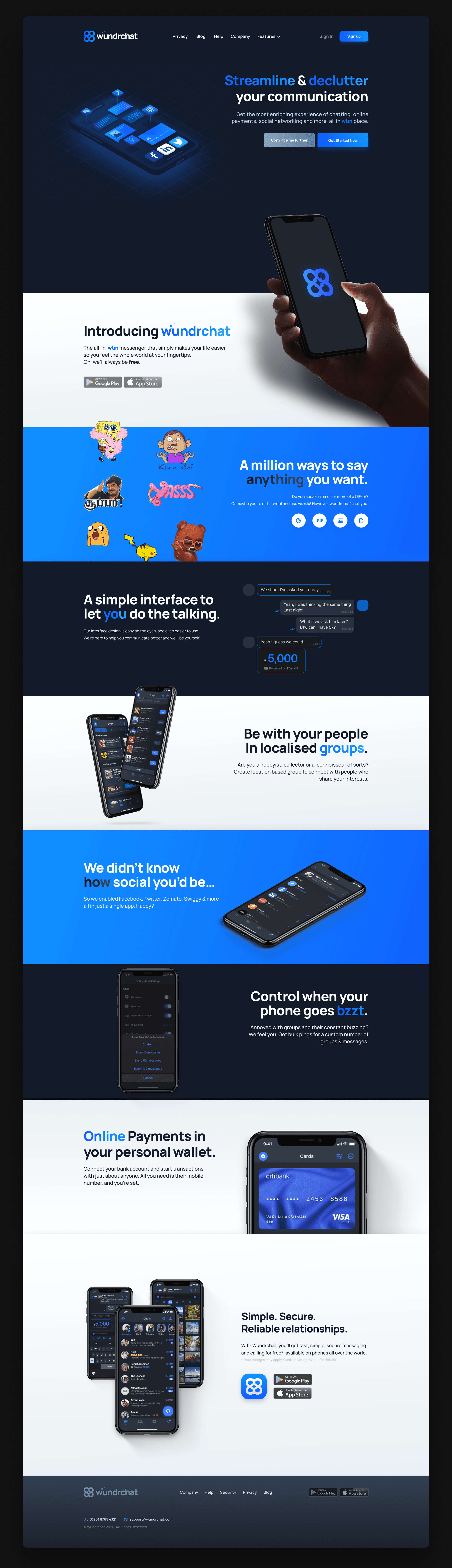
The Wundrchat website was designed to introduce the product while clearly communicating its core value proposition: a unified platform for communication, payments, and social connectivity. The layout follows a structured storytelling approach, guiding users through the product’s capabilities—from messaging and group interactions to integrated services. A dark, technology-focused interface was used to create contrast with the vibrant blue brand palette, allowing key elements such as product illustrations, UI previews, and calls-to-action to stand out. The design emphasises clarity and hierarchy through large typography, modular sections, and minimal visual noise, ensuring users can quickly understand the platform’s benefits.